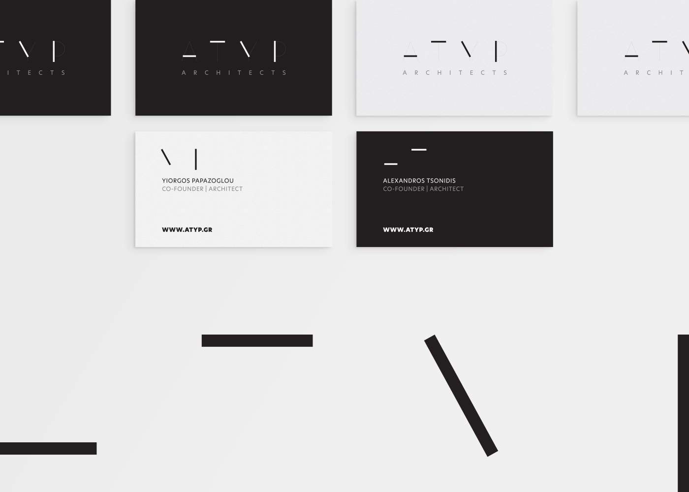
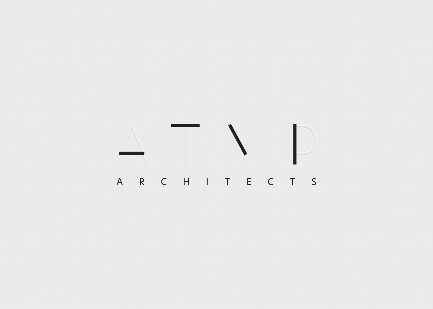
ΑΤΥP Architects
/ Logo Design // Firm Profile
ATYP is a newly established architectural firm in downtown Athens. The firm’s name was formed by putting together the initials of the two, prominent and seminal architects who founded it.
We decided that if we wanted to promote the gravitas and reliability of the firm we needed to come up with a logo whose graphics touched on minimalism.
The lines of the initials that are part of the logo are plain and austere but, by alternating between downplaying their intensity and enhancing it at the same time, we were able to evoke the sense of stability and the seamlessly impeccable services the firm offers. The background color chosen for that logo followed the rationale of minimalism as well, with charcoal black giving the logo the prestige that reflects the firm’s well-deserved standing in the field of architecture.