English Pre School | By Tsonidis
/Logo Design // Brand Identity /// Printing
“Tsonidis Schools” is an English language center with many years of experience in the field of teaching. In their latest new project, they developed a new section, for kids from 3,5 up to 7 years old, with a modern perception and a child-friendly approach. The name of the new brand is called “English Pre School | By Tsonidis”.
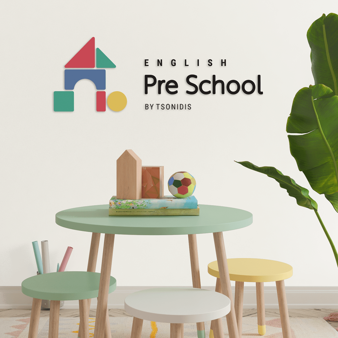
In this project, we are responsible for their new logo and the whole brand identity. When we started designing the new logo for “English Pre School | by Tsonidis” we knew we had to think about what will inspire and impress the final customers – the kids. So, we found our “inspiration corner” in their rooms. We started observing all the items, colors, and shapes you can find in a kid’s room. After this process, everything became easier…
We designed the building of the school – the main core – like a tower or a home; The tower of knowledge, where kids can feel safe like home, can learn, play, and have fun all day long! Furthermore, before we completed our final design, we came up with one more idea. We designed the logo like a wooden toy – multicolor wooden bricks – full of curves and colors!
About our color palette, we used pale shades of the three primary colors; blue, red & yellow. We wanted to create a gender-neutral logo design, minimal and contemporary!
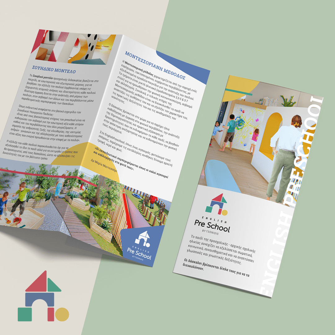
September is the month of class registration, so our client also asked us to design a new trifold brochure with their main philosophy and school program. A trifold brochure should have an eye-catching design, drive attention and be short. In this project, we are responsible for the whole outcome, from the template design to printing.


